
In a time of uncertainty and fear I’m reluctant to pass on startling information based on first pass looks at statistics. But this seems sufficiently compelling and concrete to merit our attention. Here is an article from the Italian daily Corriere Della Sera. It’s written by the mayor of Nembro, a town in the northern hot zone, and health care entrepreneur, both of whom are physicists.
Here are the relevant statistics.
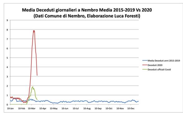
Nembro, in the province of Bergamo, is the town most hard hit in per capita terms by COVID-19. Currently the town has 31 deaths attributed to COVID-19. But when the two authors looked at the total number of deaths registered in the town in January, February and March and compared it to the average for that period in previous years they found the number was dramatically larger. 158 deaths have been registered in the town during that period this year compared to an average of 35 in previous years.
The math is simple: the average of 35 plus the 31 COVID-19 deaths gets you to 66. But the town has recorded almost 100 more deaths on top of that. As the authors say, “The difference is enormous and cannot be a simple statistical deviation.”
The authors applied the same analysis to two other towns and in both came up with anomalous deaths 6.1 times the number officially attributed to COVID-19. The ratio was even higher for Bergamo as a whole.
As I said, these numbers are so stark that I don’t think you need a lot of training in statistics to see that something very big is happening with these numbers and it is almost certainly tied to COVID-19.
This chart from the article, even though the legend is in Italian, makes the point clearly enough. Blue is the baseline. Green is the official COVID-19 death toll. And red is the actual recorded all-cause mortality in the town for the period in question.
The authors go on to speculate or argue that the answer is something like universal infection from COVID-19. They note that if all citizens of the town had been infected, 158 deaths would equal to 1% mortality, which is close to the ballpark estimate most epidemiologist are working with. (11,500 residents and 123 fatalities, when you subtract the average of 35 deaths from the recorded number of 158.)
This strikes me as considerably more speculative interpretation. Certainly there are more actual than confirmed infections in every area affected by COVID-19. So this must be part of the explanation. But it also seems possible to me that some significant part of this is people dying from other ailments they might have survived because of the degraded standard of care amidst a pandemic.
Just to illustrate the point, if you showed up today in a New York emergency room after suffering a heart attack, it seems quite likely you wouldn’t receive the same level of care you would have under ordinary circumstances. That’s not a criticism of anyone. That just seems like reality. You have extremely stressed and overworked health care workers dealing with numerous critical patients at once. On top of all that there’s probably additional complexity added by keeping you away from contagious COVID-19 patients.
It’s quite possible the dynamics of the epidemic are different in Italy than in other countries. The authors quite reasonably speculate that most of this additional fatalities are “largely elderly or frail people who died at home or in residential facilities, without being hospitalized and without being swabbed to verify that they have actually become infected with Covid-19.” Italy does have a relatively large elderly population. Perhaps limited testing is holding down the number of deaths ascribed to COVID-19. But again the numbers are so stark that it at least make sense to start running this sort of analysis in other regions and jurisdictions.
The relevant point here is that I don’t think we need to assume this universal or near-universal contagion theory. What seems clear is that death toll tied to the COVID-19 epidemic – whether clinically caused by or caused by the larger epidemic – is dramatically higher than the official numbers.
These numbers seem so dramatic to me I’m surprised I haven’t seen them elsewhere yet. And I’ve redoubled my efforts to make sure there’s not something I’m missing, or some broken link in the chain of reliability. But Corriere is one of Italy’s top dailies. It’s as solid as newspaper journalism gets in Italy. (You can see the original Italian version here and the English translation here.) The numbers as described really don’t leave a lot of room for interpretation. The only question would be if they are somehow wrong or fabricated. But given the reputation of the publication I don’t think that’s at all likely.


