Kyle VanHemert | Gizmodo
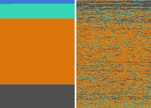
This simple pixel diagram displays the human death toll of the Iraq war. Blue pixels are “friendly” deaths (U.S. and coalition forces), green ones are “host” deaths (Iraqi government), gray are “enemy” deaths (insurgents) and orange, well, those are civilians.
It’s interesting to see how the distribution of the causalities changed in the diagram on the right, which shows the deaths as they occurred chronologically, but the one on the left, with the deaths grouped together by category, is even more powerful. As Kamel Makhloufi, the diagram’s designer points out, “Just remember that host nation + civilian + enemies = mostly Iraqis.” Of course what this diagram doesn’t show is who’s doing the killing–which deaths are attributed to combat, insurgent attacks, etc. And while it’s easy to look at these and say “look at all the civillians getting killed in this war,” it’s ostensibly that type of non-combat violence that we’re now trying to quell.
The data was culled from the documents recently published by WikiLeaks. [Flickr via Infosthetics]
The original version of the story appears here: http://gizmodo.com/5684297/whos-dying-in-the-iraq-war-in-pixels
Gizmodo is dedicated to gadgets, gizmos, and cutting-edge consumer electronics. Its tech-hungry audience stops by frequently to check out the newest products and recommendations for laptops, cell phones, PDAs, digital cameras, home entertainment, and other shiny new toys. Widely viewed as an authority in tech media, Gizmodo publishes breaking news and reviews 60 times per weekday.


