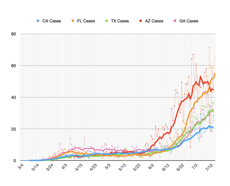
You saw Gov. Kemp’s (R-GA) order prohibiting cities and counties in Georgia from requiring people to wear masks. Look at this chart – apologies in advance that it’s a bit messy.
Here I’ve charted the outbreaks in five Crisis States on a per capita basis. These are new cases per 100,000 residents of the state in question. I only just added Georgia. The trend lines are seven day moving averages. It’s a bit hard to see Georgia because it’s sort of ducking behind Texas. Texas is the green trend line and if you look there’s a purple line kind of hiding behind it. That purple line is Georgia.
Laying low like that in the background is kind of appropriate, though I assure you that was just the order my program used. It wasn’t an editorial decision. Point being: the outbreak in Georgia is on par with the one in Texas. It’s just gotten much less attention so far.


