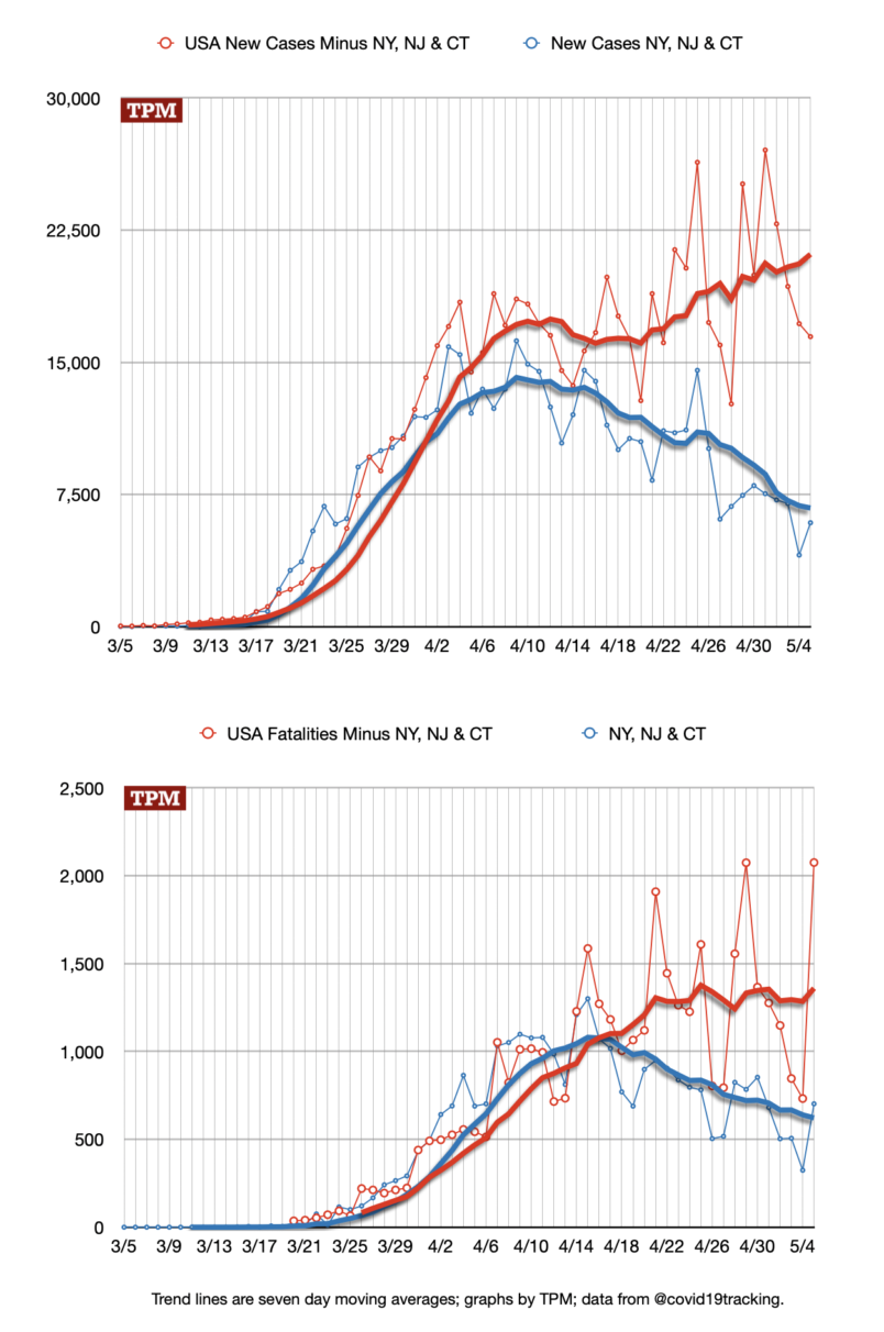
From the beginning of the COVID19 epidemic in the United States the epidemic has been dominated by an outbreak in the New York City metropolitan area. That outbreak is distinct from the progression of the disease in the rest of the country. It has its own intensity, timeline, arc. The New York City metro is an integrated economic, transportation and population reality – and thus a distinct epidemiological reality – even though it is spread over three different states. So to understand the NYC metro outbreak and the progression in the rest of the country it is helpful to separate them out visually.
Here are the latest numbers as of yesterday evening, plotted out for the number of new cases per day as well as the new fatalities reported each day.

For point of comparison, here is the nation as a whole.

Grouping the three states together captures parts of eastern and central Connecticut and the South Jersey and Trenton that aren’t really part of the Greater New York area.
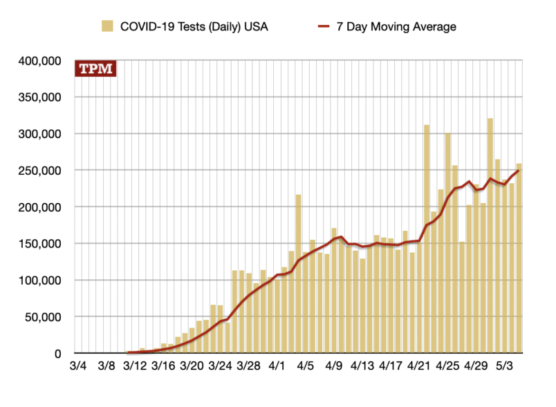
From these graphs it looks like the epidemic is growing in the rest of the country while it’s ebbing in the NYC metro. That is not necessarily clear. As you can see in this graph, the number of tests conducted across the country continues to grow.

The uptick in testing which starts in the last week of April broadly lines up with the rise in cases. A closer look at individual states and the percentage of tests coming back positive suggests the growing number of cases is a mix of actual epidemic growth and the growth in testing. There’s no simple way to disaggregate these two realities.


