There is a common aphorism in the world of statistics: ‘All models are wrong but some are useful.’ It captures an important point: Models aren’t predictions as a psychic might make so much as attempts to organize data and think critically about uncertainty. The COVID19 model out of the Institute for Health Metrics and Evaluation at the University of Washington has become something of a canonical model for the COVID19 epidemic in the United States, in part because it appears to have been adopted by the White House task force. I wanted to take a moment to look at just how far out of line it has become even with current data.
The models estimates have bounced around a fair amount. It started high, jumped back considerably and has crept back up since. This isn’t a sign of a problem in itself. It is an attempt to model the course of a disease that didn’t exist six months ago. As we proceed it is supplemented with new data.
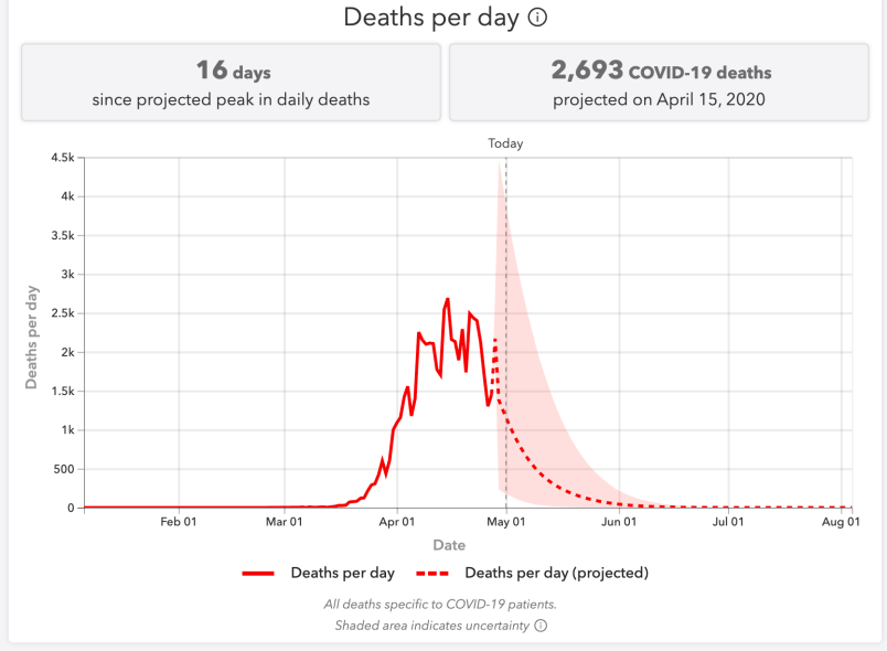
But consider these numbers. The latest estimate, released on April 29th projected 72,433 cumulative deaths through August 4th – a range from 59,343 to 114,228. But as of this morning the Johns Hopkins University data tracker shows that 63,019 people have already died. And if we look at the data compiled by the COVID Tracking Project 13,252 of those have died (or at least been reported) in the last seven days.
If we assumed the unlikely hypothetical that the average death toll in the first half of May were one half what it was in the last 7 days of April, the United States would blow through the IHME total on May 10th, almost three months before model says it should.
I’m no statistician but this is seriously out of whack and what is striking to me is that the latest projections came out only two days ago, when these numbers were as obviously out of whack as they are this morning.
My point here isn’t to criticize. These numbers speak for themselves. But to the extent we’re going to have a model that at least organizes our thinking about the range of possibilities we need either a new model or a refactored one.
Before concluding let me go back to that aphorism and focus on the ‘useful’ part. Models can be useful by showing us what features led them to estimate incorrectly. And here I welcome feedback from stats specialists. Remember back a couple months when we first started talking about ‘flattening the curve’. The idea here is that maybe you’ll have 100,000 hospitalizations regardless (numbers just for illustration). But let’s say your hospital system can only manage 10,000 patients at one time. In an uncontrolled outbreak you’ll have them in one massive burst, totally overwhelming the hospital system and leading to many unnecessary deaths. If you can spread them out over a longer period you’ll still have 100,000 people hospitalized but you’ll hopefully never go over 10,000 at any one time.
If we visualize these different shapes of disease outbreaks the first is an explosive run up and equally precipitous fall back down whereas the other is more a slowly undulating hill. (There’s a reason why they call it bending the curve! ;-)…) If you’ve watched the IHME model evolve the key issue seems to be that even though they anticipated fewer fatalities because of social distancing and curve flattening, they didn’t really change the shape of the outbreak. In other words, they reduce the size of the outbreak without significantly changing the shape. Because of this they’ve been consistently anticipating a drop off in new cases and fatalities that is somewhat proportional to the initial run up.
In fact, what we have is something more like a plateau or a very slowly falling arc where death tolls are falling but still painfully high for a long time.
We can illustrate the point here. New York has had the most intense outbreak – the most intense outbreak followed by the most intense mitigation and social distancing. So here we’d expect the most dramatic up and down. But as you can see, even here the slope is not at all symmetrical.
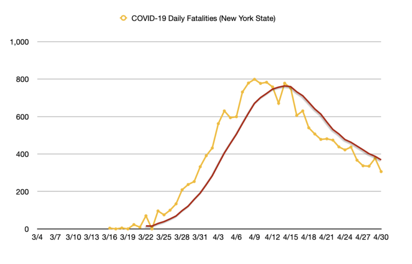
It took 10 days to get from 300 fatalities to the peak of 799 and we’re still not back under 300 per day three weeks later.
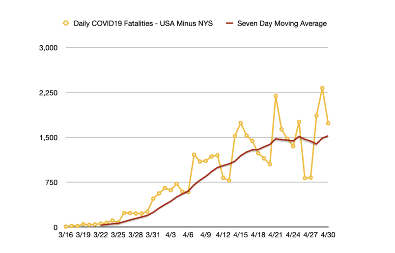
Here meanwhile is fatalities across the United States excluding those in New York State. As you can see we appear to have hit a possible plateau. But it’s not entirely clear we’re at the peak. Nor does it seems to like the daily numbers are likely to fall soon.