As part of our 2010 election coverage, we’re about to release a completely updated and redesigned TPMPollTracker, with comprehensive poll data, interactive poll graphs and composite poll averages of every contested (federal and gubernatorial) race and major political question in the country. We plan to release the final version around the end of this month. But we’d like to show it to you now in beta to get your feedback, tell us what features you might like us to add or other ways you think we can improve it.
Join me after the jump to find out more.
Let me walk you through the basics of how it works. You can find the new TPMPolltracker here. But if you’d like first, I’ll walk you through the different features and what’s included. Once you’ve taken a look, I would really appreciate it if you could drop us a line at our comments address at the upper right hand corner of the site, telling us what you think of the new TPMPollTracker, what you like or don’t like, and anything you’d suggest we can do to improve it or make it more intuitive and clear.
So let’s get started.
On the front page you see an interactive map and beneath that a list of all recently polls. In the table of polls you can toggle between polls by when they were taken or when they were released. The map is pretty straightforward. The states in bright gold are ones with polls released in the last two days, the faded gold states are states with polls released in the last week. Hover over the state to see recent polls. And click the state to go that state’s poll page.
(Click the image to go to the page)

Once you go through to a given state page, like Illinois for instance, the tags at the top of the page tells you which contests have been recently updated.
Now here’s where it gets cool. Every race has an interactive graph with a ‘trended’ average of the current polls. Here’s the one for President Obama’s job approval …
(Click the image to go to the page)

The graph itself is pretty self-explanatory. The dots are individual polls. And the trend lines represent the trends over the last year of Obama’s approval and disapproval. And the numbers in the upper right hand is an average produced by a regression analysis. The number up there in the upper right is the composite TPM Poll Average of the race.
Now the graph allows you to look at the data in a lot of different ways. (You can try out the functions I’m about to describe on a ‘live’ graph at the bottom of this post.)
One of these things I’m always curious about with polls is how the different pollsters’ ‘house effect’ affects the overall average. So say, you want to see what Obama’s numbers would look like without Rasmussen’s numbers or without Gallup? Click the “filter” button, then hit “pollsters” and then pick either “automatic” or “telephone” and then find the pollster you want to see removed from the numbers. When you do that you’ll see the trend lines and the average change.
If you want to zoom in on a particular period of time, put your cursor just below the X axis where you want to start and drag with the button held down to where you want to end. Then let go and the graph will zoon in.
You can also zoom in or alter the view from the “view” button down at the right.
You can of course also embed any TPMPollTracker graph on your own site. Just use the “embed” button. If you want to go back to the main map page, just click the “TPM PollTracker” marquee at the top.
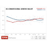
Here’s what the embed looks like (in this case for the ‘Congressional Generic Ballot’ …
You can see it here or click on the images above. As I said, we’re making final revisions and optimizations. But the functionality is pretty much complete. We’d be greatly in your debt if you could take a moment and give it a spin. And then let us know what you think.
We really appreciate it.
(ed.note: The new TPMPollTracker has been built from the ground up by TPM’s Al Shaw. Here’s Al’s discussion of an earlier version of the application. It’s a deceptively simple and elegant piece of programming.)


