Prime Only Members-Only Article

Placing New York’s Outbreak in the Context of Today

Emergency Medical Service workers unload a patient out of their ambulance in Brooklyn on April 18, 2020. (Photo by Justin Heiman/Getty Images)
|
July 27, 2020 2:35 p.m.
THE BACKCHANNEL
FREE EDITION
Your subscription could not be saved. Please try again.
Your subscription has been successful.
NEW!
A FREE email newsletter from Josh Marshall An email newsletter from Josh Marshall

Here is a graph that provides important perspective on the current outbreaks in the South and Southwest compared to the COVID outbreak in the New York City metropolitan region in March and April.

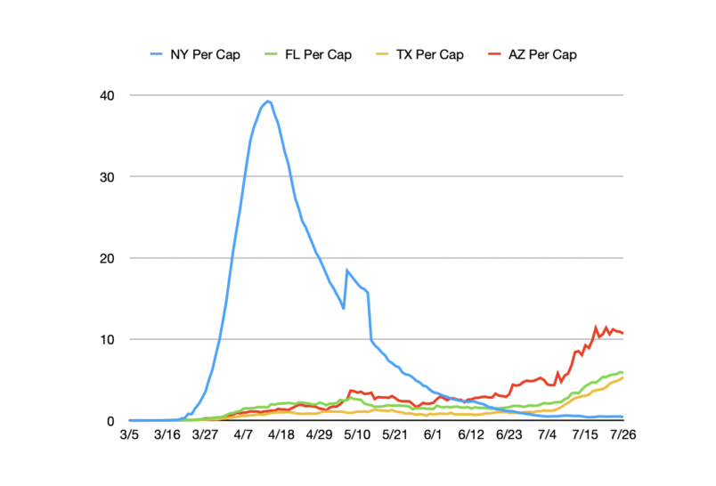
This graph shows daily fatality numbers in New York, Florida, Texas and Arizona on a per capita basis (fatalities per million residents) expressed as a seven day moving average. These are statewide numbers for New York. But it’s overwhelmingly the New York City metropolitan area. As you can see, that outbreak still totally dwarfs what is currently happening in any of the other three states. Arizona is substantially worse than Texas or Florida. But the state’s apparent peak is still only slightly more than a quarter of the daily death toll New York saw in early April.

This is a members-only article
Small Team. Big Results.
We’re proud of what our small newsroom has accomplished and it’s not hyperbole when we say that without our members, none of this would be possible.
Free memberships available for students and those experiencing financial hardship.
Already a member? SIGN IN
Masthead Masthead
Founder & Editor-in-Chief:
Executive Editor:
Managing Editor:
Associate Editor:
Editor at Large:
General Counsel:
Publisher:
Head of Product:
Director of Technology:
Associate Publisher:
Front End Developer:
Senior Designer: