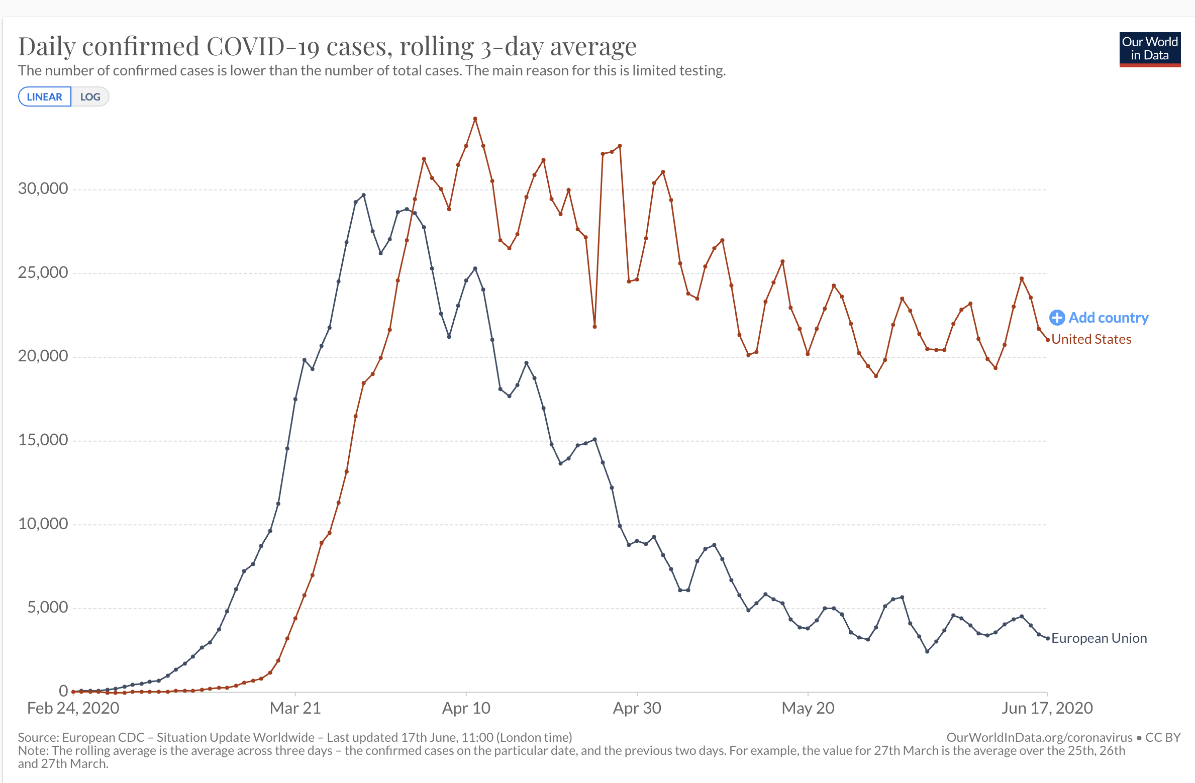
I have spent a lot of time analyzing the New York COVID epidemic both because it was the center of the storm in the United States and because it affects me, my loved ones and coworkers so directly. The graphed shapes of the New York outbreak and the nationwide outbreak are quite different. The former rockets upward and falls down again at a slower but still comparable arc. Nationwide it’s quite different. The numbers rocket upward and then basically plateau. It’s not a proper comparison. The epicenter of an outbreak has different dynamics than the more rolling spread of contagion in less hard hit areas. This is why the proper comparison is not New York vs the United States or the United States versus any European country, all of which are dramatically smaller than the US, both in geography and population. The proper comparison is the United States (~330 million) vs the EU (~440 million). This brings together hotspots and peripheries, urban and rural and all the mix of population densities into one. As you can see here the progress has been very different and not at all good for the control of the epidemic in the United States.