Let’s be honest: The feminist movement is not exactly known for its savvy design. Too many women’s organizations have cliché, homogenous logos and visual identities that reinforce stereotypes and do no favors to momentum-building. There are countless examples of organizations with forgettable icons of pink, leaping, curvaceous women as their brand stamp, and too few with design language that strikes and sticks.
It’s not that feminism isn’t about women’s bodies. A glance at the headlines will readily reinforce the centrality of the fight for bodily autonomy, from the egregious mishandling of sexual assault on college campuses to the incessant attacks on a woman’s right to an abortion.
But feminism is not exclusively about women’s bodies, as the design de rigueur would suggest. It’s about their intellects, too. Furthermore, it’s not just about women. It’s about people of all gender identities being able to live authentically and with dignity. Seems to me that a curvy lady only serves to reinforce the stereotype that feminism is about a sort of essential femininity, what Lisa Jervis cleverly coined “femmenism.”
If the “medium is the message,” the message of most women’s organizations websites is, We’re too busy to care. I can’t tell you how many times I’ve cringed upon visiting the website of an organization whose work I deeply admire for the first time. Crowded copy dominates. The eye wanders, unsure where to settle down. Images are too small at best, altogether rare at worst. It’s like discovering that your favorite aunt is a hoarder—you still love her, but she’s gone done broken your heart with her internal dysfunction.
I get it. The truth is that most women’s organizations are overwhelmed, understaffed, underfunded. Nonprofit CEOs have told me time and time again that they are too overwhelmed to do the work of thinking carefully about information hierarchy and clear, clean layout, or don’t have enough funding to pay experts to do the thinking for them. But we can’t keep putting design as the last thing to get some love.
The lack of appealing, fresh visuals for feminism is always a problem, but as we stare down a potential shot—the best we’ve ever had—at electing a female president, it feels more urgent than ever. Hillary may run in 2016: What would be the design campaign that would draw the support she deserves?
Obama had Shepard Fairey, whose value is probably impossible to overestimate in terms of building popularity among young voters. The language of street art brought into a presidential campaign was hugely powerful; the image itself was unforgettable and eminently shareable. Who is Hillary’s Fairey godmother, as it were?
Jessi Arrington, a Brooklyn-based designer who works with TED, Etsy and a range of other organizations and corporations, thinks the design should reflect voter optimism, but perhaps even a little impatience: “When I first saw the ‘Ready for Hillary’ campaign, I responded positively,” Arrington said.“But the longer I sit with it, the more it seems defensive, as if having a female as the leader of our country is something for which we each need to attest our preparedness. Hey, I’m beyond ready.”
Kenesha Sneed, a Los Angeles-based designer, emphasized that she’d like to see a design that doesn’t shy away from making Hillary’s sex a centerpiece: “I’d love to see her work the women’s angle throughout her visual campaign, starting with the artist’s she brings on,” she said.”Stephanie Rond, Fefe Talavera, and Olympia Zagnoli are all examples of women graphic artists that could add their unique style to her personal brand. It’s sorta like when Beyonce came on stage with an all-girl band to back her…it sounded great and the men still watched.”
The closest thing the women’s movement has had to a Hope poster-like virality in the last decade was The Girl Effect, an online video that launched in 2008, widely recognized as the turning point in the wider public’s understanding of how powerful an investment in girls can be. The basic idea, as reported by the World Bank, is that investing in women and girls strengthen countries’ ability to grow, reduce poverty, and govern effectively; women and girls reinvest an average of 90 percent of their income in their families, compared to a 30 to 40 percent reinvestment rate for men.
This was an argument that NGOs and government leaders, Hillary Clinton included, had been making for years—largely to deaf ears. The Nike Foundation, in conjunction with the Novo Foundation and others, put real advertising dollars behind the concept and, voila, a new era of interest in girls and women philanthropy was born. The original video, created by powerhouse advertising firm Wieden & Kennedy (which also boasts clients like Coca-Cola and Facebook), is a distillation of decades of development jargon—just simple animated graphics that lay out the problem, a great score, and a clear, top line translation of the opportunity.
It spawned a second video, a “movement” website with more than 325,000 followers on Facebook and nearly 100,000 on Twitter (the original account was started by a mother of teenagers in Illinois who was simply so inspired by the video that she wanted to do something), and a massive increase in philanthropic dollars directed at girls’ causes. The “girl effect,” as many feminist leaders have argued, is not a magic bullet. Perhaps the branding has sometimes bordered on oversimplification, and yet, it’s inarguably worth studying (as did Harvard and Rockefeller) just how a jargon-laden development argument became a viral meme so quickly.
It’s not just advertising firms that know the value of design. A glance at some of the most successful next-generation efforts reveals they get it, too. Rookie, started by fashion wunderkind, Tavi Gevinson, is a pleasure to look at with its hand-drawn lettering and grid of idiosyncratic images—sort of a reclaimed middle school pastiche. Feministing’s recent redesign remixes the tried-and-true logo with even more of a focus on functionality and accessibility, and the powerful personalities that author each blog post. And the Make It Work campaign, which launched with a BuzzFeed-style quiz to get a whole new demographic thinking about work-family policy, is visually unlike any similar efforts that have come before.
This is not about third wavers looking down their noses at second wavers who have the design acuity equivalent of AOL email addresses. Overlooking good design is a strategic failure on the part of feminist leadership, and it’s part of what is keeping the movement from realizing its full political power. Let’s hope like hell it doesn’t keep Hillary out of office should we have the chance to elect her.
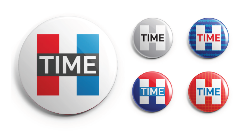
Lead photo: We put the challenge to notoriously playful designer Jessi Arrington of WORKSHOP: “What could you dream up for Hillary’s hypothetical campaign in just one hour?” She delivered these striking buttons.
Courtney E. Martin is the author of Do It Anyway: The New Generation of Activists and the co-founder of the Solutions Journalism Network. She is hard at work writing a new book and raising a new human in Oakland.


I didn’t even notice the H on those buttons for Hillary and I thought TIME was something to do with Time Magazine when I first looked at them before reading through the article. It looks very masculine, of course with the all-important perfunctory Red, White and Blue, mandatory for almost any campaign. I get it now, but its not very inspiring. The minimalist look seems to be the newest of all fashions in graphics these days. And block lettering…seriously? Why not just put pant suits on that H. Yeah, its modern all right, but its also so staid, so Eh…
But the article makes a good point. Those swishes and all that pink and purple in female related iconography has really got to go. I realize Hillary needs something more than a cluttered Pinterest board to make an enticing but bold invitation into her campaign. In the world of commercial art and design, this has got to be a tough one. Fairey’s riff on '60’s Album art, was pure genius to attract both baby boomers and young people alike. That won’t work for Hillary…nor will graffiti art. There’s too much cognitive dissonance with that and her own persona.
Well good luck artists of all shapes and sizes. You’ve got your work cut out for you. Having to top the art-inspired campaign of Obama’s, has certainly set the bar high this time.
One thing Hillary should stay away from is designing a cluttered website. But nor should she have one that looks like its all business…a manly-man’s pitfall in advertising. I so much dislike that sterile look.
I liked the Girls Effect video but I’m not sure that style is up to the level of a national campaign for the presidency. Its more suitable for a Department of Health and Human Services website if anything. Well…good luck. Food for thought.
When I saw those buttons, my thought was that Time magazine had done a new logo, which was inspiring you to talk about design. In a million years, I would never have gotten to Hillary. So not every professional effort is a move forward. (Sure, an hour is no time, but what on earth is that “time” doing in there??)
Honestly, they should look to Robert Reich, not as the former Labor Secretary, but as a cartoonist and someone who is clearly associated with all things Clinton. His video explainers describing the state of our economy are really quite good. The intricacies and yet the simplicity of his presentations are a good place to start. He has a natural whimsy to his art and his cartoons look spontaneous and fresh.
https://www.youtube.com/watch?v=ik1y4ZNSjek“Kenesha Sneed, a Los Angeles-based designer, emphasized that she’d like to see a design that doesn’t shy away from making Hillary’s sex a centerpiece”
I hope they stay away from this approach. I don’t see any potential benefit to incorporating gender into any possible Hillary campaign identity. It’s too trivial for what the broader message should stand for, which I see as a message of transcendence and looking beyond her gender at far more important issues. The right is going to hammer the dog whistle machine like you’ve never seen before, and it’s going to take a door of lead 60 feet thick to contain their sexism if Hillary ends up the front runner/nominee. The optics of her pushing past all of that has the potential to make a far bigger statement to those who notice. Utilizing “sex [as a] centerpiece” points straight back to why so many feminist organizations’ marketing material looks like pink, curvy nightmares. Footnoting her gender is petty and antithetical to feminism. Move away from gender and focus on fresh, relevant and positive.
I can remember when the appeal of feminism was visceral, existential and experimental, and had nothing to do with marketing, and hadn’t morphed into achieving a Glass Ceiling for a woman or two.
I have no doubt that Hilary Clinton will draw all the misogynistic ire of the right, and no hope that her ascendance - in and of itself - will fundamentally change anything.