Brian Barrett | Gizmodo
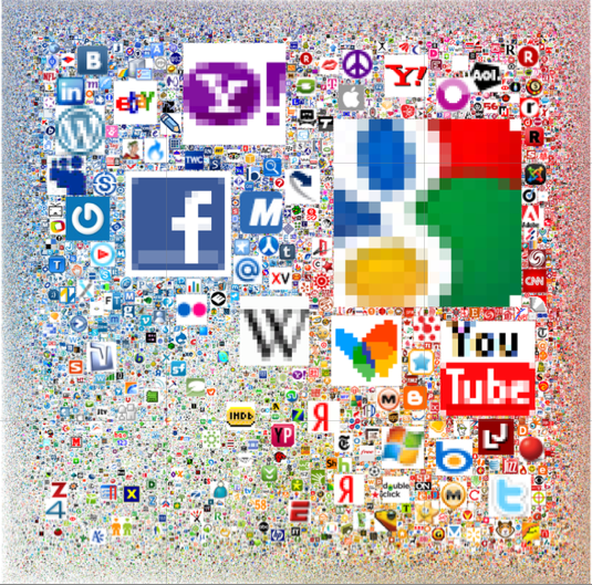
How do the 288,945 most heavily trafficked sites on the internet stack up against each other? Take a very close look at this chart to find out.
While you could spend all day with a microscope trying to sort out the layers lurking behind AOL and IMDb, the preferred browsing strategy is to check out Nmap’s interactive version. As for the method to the radness:
The area of each icon is proportional to the sum of the reach of all sites using that icon. When both a bare domain name and its “www.” counterpart used the same icon, only one of them was counted. The smallest icons–those corresponding to sites with approximately 0.0001% reach–are scaled to 16×16 pixels. The largest icon (Google) is 11,936 x 11,936 pixels, and the whole diagram is 37,440 x 37,440.
Which is, uh, huge. As for the traffic data itself, it was culled from Alexa earlier this year.
Happy hunting! And please remember take a moment of appreciation for LiveJournal hanging tough. [Nmap via The Daily What]
The original version of the story appears here: http://gizmodo.com/5620681/all-300000-biggest-websites-visualized-with-their-icons
Gizmodo is dedicated to gadgets, gizmos, and cutting-edge consumer electronics. Its tech-hungry audience stops by frequently to check out the newest products and recommendations for laptops, cell phones, PDAs, digital cameras, home entertainment, and other shiny new toys. Widely viewed as an authority in tech media, Gizmodo publishes breaking news and reviews 60 times per weekday.


