THE BACKCHANNEL
FREE EDITION
NEW!
A FREE email newsletter from Josh Marshall
An email newsletter from Josh Marshall
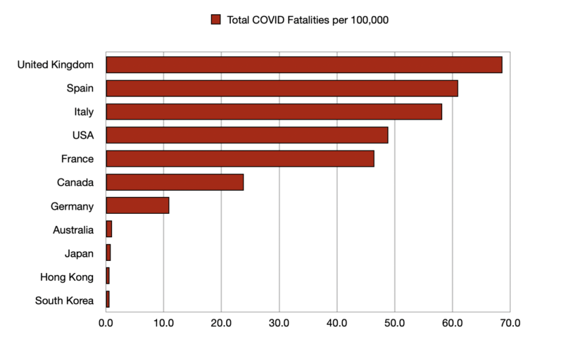
Here is an example of where visualizing data can be very illuminating even if you’ve been steeped in the data in numerical terms. As I mentioned earlier, here is a graph of per capita COVID fatalities to date in the US and the other peer nation states around the globe.