Within a day of launching her presidential campaign, Hillary Clinton got her very own namesake font.
Twitter user @RickWolff, whose bio identifies him as a freelance designer, posted a font Monday that riffed on Hillary for America’s logo. #Hillvetica quickly went viral:
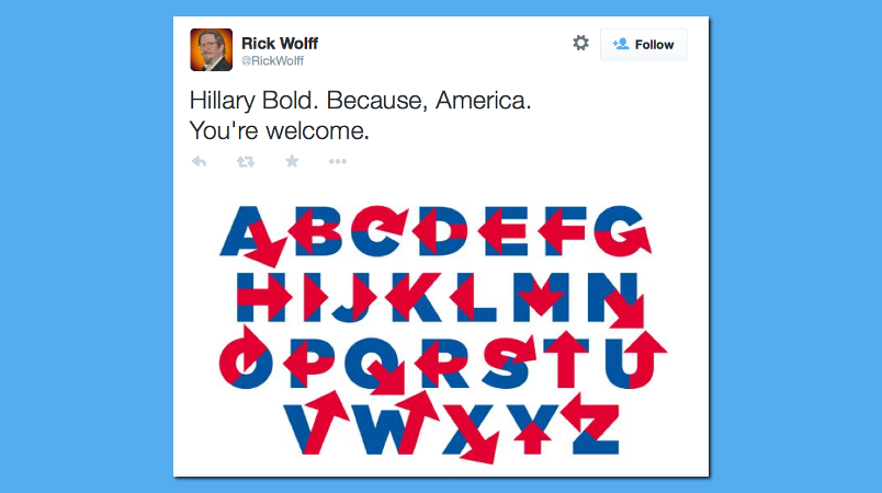
Hillary Bold. Because, America.
You’re welcome. pic.twitter.com/Y2HRzM4tMn
— Rick Wolff (@RickWolff) April 13, 2015
I need some Twitter analytics this morning. I feel like that woman who flew to South Africa, but in a good way! #Hillvetica
— Rick Wolff (@RickWolff) April 14, 2015
If I could afford font software, I’d make & release #Hillvetica, free. Which crowdfunding should I use? pic.twitter.com/SRoigWDGr6
— Rick Wolff (@RickWolff) April 14, 2015
Clinton’s newly unveiled campaign logo had been heavily criticized on social media for the mixed messaging that resulted from having the red arrow overlaying the ‘H’ point to the right. Wolff made sure that wasn’t an issue in the font:
I went for directionlessness. RT @JonQuixote: @seanbonner @monteiro @sdkstl @hughcartoons … it doesn’t point left often enough.
— Rick Wolff (@RickWolff) April 14, 2015
If the Clinton campaign needs any design work done over the next 18 months, they know where to look.


I’m no graphic designer, but do fancy myself to have a fair sense for aesthetics.
As an art reviewer might soften it: “It just doesn’t speak to me.”
What’s the point? (pun not intended, but I’ll take it anyhow)
At least make all the arrows point up and to the left, and certainly none downwards. Geez.
Heh. That’s cool.
This was, perhaps, somewhat predictable. She’s the frontrunner (both in the Dem primary and overall) and she’s a she, so the MSM was going to be on mission to find something puerile to latch onto instead of talking at all about any of her positions, substance, etc. We’ll be watching this happen all throughout the campaign over the next year+…nonsense designed to encourage people not to take her seriously, focus on childish things like her chosen campaign symbol and weapons of mass distraction vis-a-vis elephants in the strawberry patch like Benghazi and her email. Meanwhile, even CNN, in all its vapid glory, managed to respond to Rubio’s announcement with a piece about his positions, which of course entailed discussion about his competitors positions and the GOP primary field. You know, just in case you hadn’t heard about them all and had their idiocy spoon fed to you yet on their behalf.
The MSM has appointed itself the great equalizer when it comes to national elections, and they’ll be fucking damned if they’re going to sit idly by while someone runs away with one when they could’ve had a horse race narrative.
I’m a book designer, and this is a fun idea, but no, this design doesn’t function as good typography. It’s a (fun but) lopsided mess.
The H with the arrow was a bad choice from the start. It’s pointing to the right, which can be construed as something other than moving forward. It can also be turned upside-down to change the direction of the arrow.
The design should be unambiguous, and as tamper-proof as possible. Final grade is C. Class dismissed.
People, don’t get too hung up on symbology and semiotics. Things may not mean what you think they mean.
Before I retired and I worked for the US Department of the interior [Park Service, USGS, BLM], occasionally some idiot conservative in congress or some state legislature would get upset that the buffalo in our agency’s logo was heading to the left. Never occurred to them that the animal was facing West [in a manifestly destiny kind of way].
http://www.doi.gov/ui/doi/images/doi-seal-200.jpg
I look at the logo as someone acquainted with vectors and graphs where the positive direction is to the right. Negative, of course, is to the left. Like it or not that’s just the way the Cartesian system works. Big deal, it’s just a logo.
Now, if the arrow was manifesting from the top of one of the legs of the “H” and pointing upward, my how Freudian!