


At the request of the Senate Finance Committee, the Congressional Budget Office has produced a report analyzing trends in the distribution of household income from 1979 until 2007 — just before the economy fell off a cliff.
The results will be familiar to economists and policy wonks, but they’re eye-popping. These charts and graphs tell a story of a massive income growth in the Reagan and post-Reagan years, and particularly during the George W. Bush administration — but only for the famous 1 percenters.

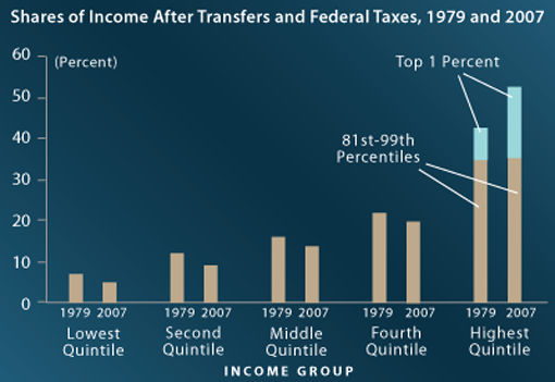
CBO found that, between 1979 and 2007, after-tax income grew by 275 percent for the top 1 percent of households. That dwarfs income growth for middle and lower income households over the same time frame — nearly three decades during which the rising tide vaulted yachts and cruise ships, but barely nudged house and tugboats.
Specifically:
CBO finds that, between 1979 and 2007, income grew by:
* 275 percent for the top 1 percent of households,
* 65 percent for the next 19 percent,
* Just under 40 percent for the next 60 percent, and
* 18 percent for the bottom 20 percent.

There are many reasons for this, but the biggest, according to CBO, is a concentration of pre-tax income toward the top of the pay scale.

CBO notes, “the highest income quintile’s share of market income increased from 50 percent to 60 percent [between 1979 and 2007]. The share of market income for every other quintile declined…. In fact, the distribution of market income became more unequal almost continuously between 1979 and 2007 except during the recessions in 1990-1991 and 2001.” There’s no professional consensus about why this happened, though the explosive growths of the financial sector, executive compensation, and celebrity pay are among the likeliest culprits.
But federal policy has exacerbated the trend. Income taxes have become less progressive in the last three decades, and federal programs that used to benefit poor people have shrunk or disappeared altogether. That’s left Social Security and Medicare as the biggest federal wealth transfer programs, both of which benefit people at all income levels, not just the poor and middle class. In other words, federal programs have become less progressive in their distribution.
If you think of all income as a single pie, almost everyone’s slice has shrunk since 2007 thanks to the explosive growth of the top 1 percent relative to fairly minor gains for everybody else.

Check out the full report here: