


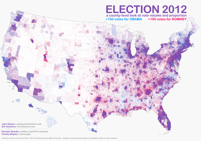
This highly detailed graphic by John Nelson shows count-by-county results of the 2012 presidential election. In an email to io9, Nelson described his map: “(It’s) a pointillist look at the 2012 election results, which does a fairer job of illustrating where, how many, and how people voted in the election than the more typical full-color generalization.”
See the full, high-res version here.